another day, another macaron. or two! monday lunchtime, post-park, saw us tumble once again into adriano zumbo. my primary mission, because i had finally run out of bread in the house, was to try the chorizo-and-olive-stuffed baguette which i’d been eyeing for a couple of weeks: a club of bread into which had been baked sliced-up sausage and olives (and today, the counterboy informed me, also mushrooms and tomato.) you have questions, i’m sure: is it still a baguette if it has all this stuff in it, and cheese on top? the jury is still out on that one. is it tasty? oh yes. warmed up in the microwave, it was all moist salty bits all the way through a satisfyingly chewy dough. definitely not the featherweight baguette you might find around these parts (though who am i to judge them when i haven’t actually set teeth on an actual frainch baguette).
and the macarons? the pistachio was plump and hefty, and very, very sweet. i would rather have had a stronger pistachio flavour, and maybe some discernable nuttiness. the lavender was intensely perfumed, very lavendery, which is terrific if you are a fan of the herb. i love it in a handcream or a fancy soap, but i’ve always been a bit overwhelmed by the floweriness when i’ve eaten it. so it was with this encounter. still, i was impressed with its true flavour and luscious texture.
i was drawn to these macarons because of their pale, dusty hues. i am working on a brand-redevelopment project at the moment, and one of the tasks has been to come up with a new colour palette of muted tones. i don’t actually have to come up with the colours (or the layout, woohoo!) — it’s a collaborative project, and i get to discuss colours and typefaces and columns and footers with two other designers. it’s great!
what i do get to do is draw the pictures. it’s both a good thing and a bad thing, because i haven’t done an illustration job in years, and i’ve been itching to get back into it, but because i haven’t drawn to a brief in, well, years, it’s been quite a challenge to get my head into that space. i think i may have the main character worked out though; now i have to get cracking on the host of crafty monsters.

anyway. while i was sitting here doodling blobby shapes holding paintbrushes this evening, i discovered the storm that was brewing over the new london olympic logo. (yes, i’m aware that i would probably get more drawing done if i weren’t drawing at the edge of my desk with the internet on.) several clicks later, all i want to say at this point is, “how come i (will) never get paid £400,000 to design a logo?”.
and also, why have they used that hideous font?

oh ok. and also, the logo was designed (according to the press release), “reflecting a brand savvy world where people, especially young people, no longer relate to static logos but respond to a dynamic brand that works with new technology and across traditional and new media networks.” and so, the promotional video of coloured shards sweeping through the streets of london (in time with a slightly stressful and irritating soundtrack) actually works quite well. but then every time it appears — the static logo, frozen onscreen — argh!
the outline! the drop shadow! argh!
maybe they’ll have to “print” it — animated — on e-paper.
[ edit: mere hours later, you will not find the colour shards video at the link above, because “new olympic logo causes epileptic fits“. PAH.


9 Comments
i really like your art lady. she reminds me so much of everyone i work with… in a friendly way 🙂
also maybe adriano zumbo will pay you in POUNDS of macaron to illustrate his macaron menu 🙂
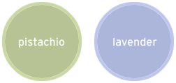
i heart the pistachio and lavender of your circles. the pistachio is almost the exact colour of my living room in los angeles; the lavender is the perfect match for my bathroom (no photos in there, sorry).
that olympic logo is so eighties smash hits magazine.
deb: i am pleased you have friendly thoughts about your colleagues, after some of your funny stories about art histrionics.
and zumbo… i’m working on it! first i must impress them with my macaron-eating prowess!
santos: nice! i’ve been wanting to paint my bedroom green for years, and i have the paint swatches from each trip to the hardware store… but i’ve always chickened out. your living room looks very welcoming though, not at all the like hospital lobby i’ve been afraid of. 😉
and you know what? i really liked 80s “smash hits”. the british one, right? and that “no.1” magazine. i still have my “collector’s edition” from when wham! broke up. but the olympic logo? i really don’t like it so much.
i totally hearted smash hits and no.1. as far as graphics went in smash hits though, i remember there was a leaning towards neon and that new wavey action going in that logo. perfectly fine for background graphics for bananarama lyrics, but not for the olympics!
argh! I am a sucker for bread with sausage baked in it. Oh so good. Where is it found in the streets of Balmain?
santos: ah. but did you also love “jackie” magazine, and the pig comic called “oink”? hmm. perhaps i have given too much away. 🙂
sue: you will find sausage bread and other wonders at 296 darling street. go forth! plunder!
WOW. I love that art lady too — and, did you say, “host of crafty monsters”???? What IS this brand redevelopment???
it’s… ARTFILES!!!
bwahaHA. bet you weren’t expecting that.
me neither.
OY. A host of monsters indeed!
You must be glad there’s other designers on the job too.
I should’ve known, what with the “art” there and those funkerific black glasses. 🙂